Britain's best interior designers on the paint colours you just can't go wrong with
People across the country are using their time to decorate, and with the big companies still running delivery services you're likely to be able to get pretty much any colour you like.

But what to choose? How can you pick a colour which will look good forever, rather than matching a passing fad?
Country Life's Giles Kime put this question to some of Britain's best interior designers: what are your desert island paint colours? The shades you couldn't do without?
Here's what they came up with.

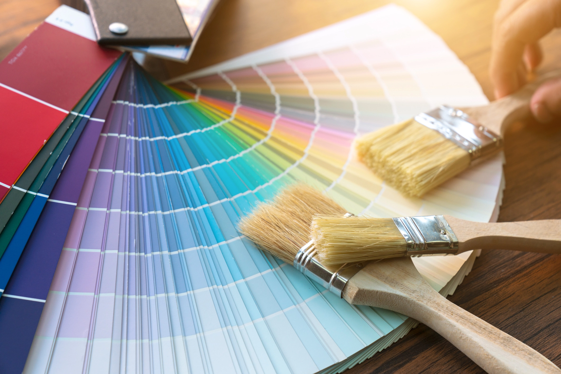
N.B. As ever with paint, please bear in mind that how the shade comes up in these illustrations won't perfectly match what the same colour looks like when you see it on your wall, with your lighting and your furniture. Tester pots are always a good idea.
Emily Todhunter

Neutral Subtle Ivory 3, Dulux — Our go-to off white for ceilings, cornice and woodwork
Dark Down Pipe, Farrow & Ball — This is a colour we use often, because it works with everything
Soft Eau de Nile, Edward Bulmer — A pretty, gentle green that works well in a room with a garden view
Bright Deep Water Green, Paint & Paper Library — An upbeat turquoise that works in rooms that need a little oomph!
Emma Sims Hilditch

Neutral Shell, Neptune — This is a staple for cabinetry, furniture or walls — it brings a sense of space and light to a room
Dark Picture Gallery Red, Farrow & Ball — This is a beautiful rich red that can be used to accentuate the grandeur of a building
Soft Blue Gray, Farrow & Ball — Depending on the light, this can look slightly blue-toned, creating a serene atmosphere
Bright Cook’s Blue, Farrow & Ball — A deeply pigmented colour, perfect for use in both kitchens and exterior dining areas
Henriette von Stockhausen

Neutral Wimborne White, Farrow & Ball — A perfect, soft all-rounder that I like for ceilings if rooms aren’t too tall
Dark Studio Green, Farrow & Ball — I have this colour in my kitchen and love its depth and how it looks by candlelight
Soft Jonquil, Edward Bulmer — It creates a warm, comfortable atmosphere, as well as looking wonderfully old-fashioned
Bright Dark Yellow, Rose of Jericho — This gives a facelift to any room and works well with antiques, gilt frames and treacly oil portraits
Katrin Cargill

Neutral Jabot, Dulux — The perfect neutral pure white, neither yellow, nor blue or green, that will sit with anything
Dark Camo 2, Papers and Paints — Good for a dining room with rich woods, reds and candlelight
Soft Angie, Little Greene — A soft, pretty pink that can work in bedrooms as well as sitting rooms; sweet, but not cloying
Bright Circle Line, Mylands — A strong, but great, yellow that can give a room gravitas and it works with so many fabrics
Lucy Elworthy

Neutral Slipper Satin, Farrow & Ball — A gentle colour that works especially well with stone, wood and brick
Soft Half La Seine, Zoffany — Fresh and serene, this works well with indigo, soft pink and almost any pastel or bright colour
Dark Inchyra Blue, Farrow & Ball — Good colour for bookcases or a TV wall; inviting and smart
Bright Yellow Ground, Farrow & Ball — It’s warm, and particularly good with dark reds and lavender purples
Luke Edward Hall

Neutral Setting Plaster, Farrow & Ball — Soft and delicate. As the name suggests, it’s similar to a freshly plastered wall
Dark 4-050, Papers and Paints — I love a 1970s shade of chocolate brown; I used it last year on the walls of a disco drawing room
Soft Pistachio, Papers and Paints — Green is my favourite colour and this ice-cream shade is calming. Nice for a 1930s-style bathroom
Bright Manhattan, Papers and Paints — This is a wonderful shade of coral. Lovely in gloss for a hallway or for a dressing room
Susie Atkinson

Neutral Slate II, Paint & Paper Library — The perfect Neutral: at once warm pebble and sandy grey, it sits beautifully next to any white
Dark Mulberry Red, Abigail Ahern — A hypnotising berry red that is so dark it’s almost black — perfect for a moody hallway
Soft Faded Blossom, Cassandra Ellis — The very softest of all pinks with a luminosity that always makes a room feel uplifting
Bright Pale Powder, Farrow & Ball — The most luminous of aquamarine tones that is both subtle and enlivening
Sophie Elborne

Soft Norsk Blue, Zoffany — A beautiful green-blue, it’s ideal for hallways and cosy rooms
Dark Georgetown, Paint & Paper Library — A cosy brown that looks great with oranges and reds. It sits well with brass or gilt picture frames
Neutral SC292 Papers and Paints — A white that is neither too grey nor too yellow. I use it on woodwork or to paint out a room
Bright Invisible Green, Edward Bulmer — This looks good on skirtings and doors with off-white walls
