Why you'll see matching front door and window colours across great swathes of the English countryside
The colours that estate owners choose to paint their buildings and cottages lend them a highly distinctive feel. Eleanor Doughty finds out how — and why — the different shades are chosen.
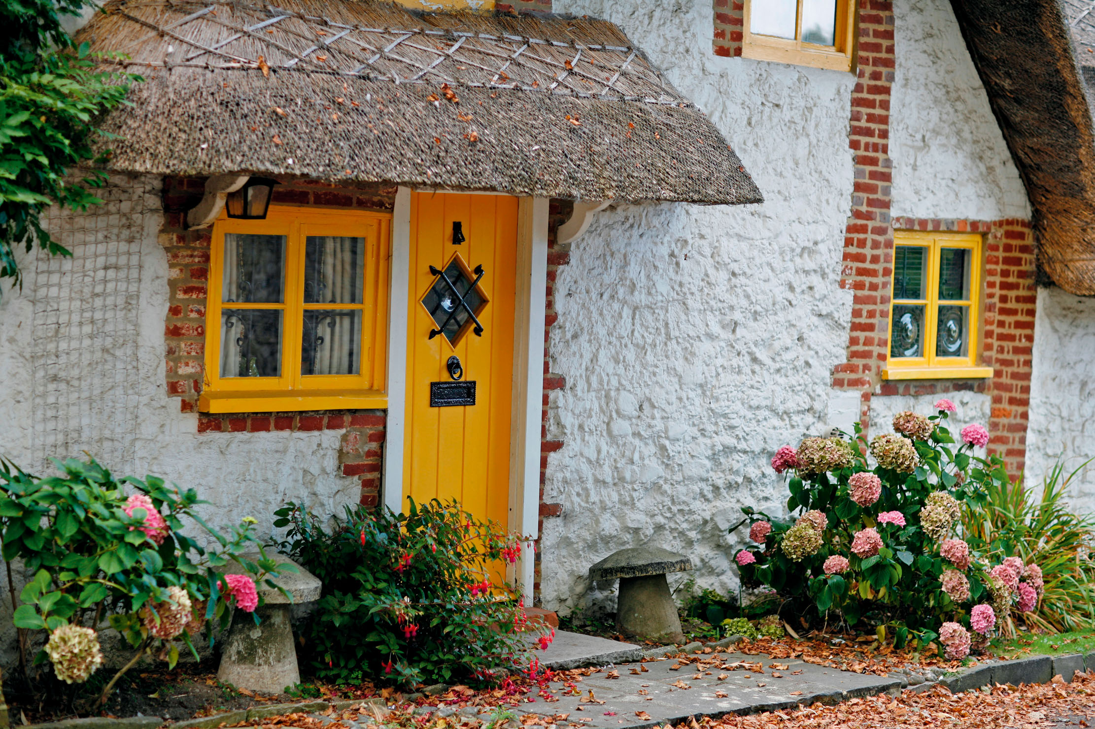
If you drive through Midhurst in West Sussex, you’re likely to spot a house or two with their timbers painted neatly in saffron yellow. There has long been a tradition for estate owners to paint exterior timbers to signify ownership, but Cowdray’s yellow must surely be the most recognisable. It derives from when Liberal politician Weetman Pearson, 1st Viscount Cowdray inherited the Cowdray estate in the 1920s and matched his political colours to his cottages — painting the roses yellow, so to speak.
What we think of as ‘estate colours’ are a relatively new phenomenon, explains the historic paint consultant Patrick Baty. Thanks to new technologies, ‘in the second half of the 20th century, a wider selection of brighter colours that could withstand ultraviolet light and weathering were produced’.
A century ago, country-house watchers would have passed through estate villages with greens, reds, brown-reds, browns and greys adorning estate timbers, says Mr Baty. ‘They were the cheaper colours, because who would spend a fortune on large expanses of paintwork for buildings around the estate?’
Today, with the advent of modern paint — and an entire marketing industry to come up with ideas — estates can afford to look beyond earthy colours if they so desire. The Duchess of Rutland explains that the Belvoir Castle colour is a ‘bronze brown — we discovered it after a scrape test on the original Charles II building, so we have used the same colour all over the estate ever since’, whereas, on Lord Egremont’s Leconfield estate in West Sussex, the colour is a muddy brown.
Few colours have ubiquity to echo the Chatsworth Blue, which, in 2014, was colour-matched by Brouns & Co as a linseed paint ‘which wouldn’t fade or turn grey over time’. Upon asking the estate when Chatsworth Blue came to be, no one was quite sure, but the suspicion is in the 1980s.
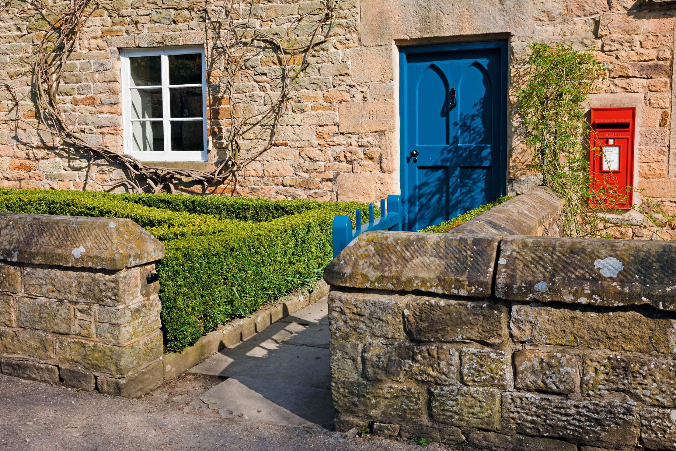
On the Brampton Bryan estate in Herefordshire, the Harley family uses ‘an interesting turquoise colour’, notes the founder of the eponymous natural paint company Edward Bulmer, and, up in Perthshire, Joa Studholme, Farrow & Ball’s colour curator, created the moody ‘Inchyra Blue’ for the Inchyra estate: ‘It very much reflects the environment, with a slight modern twist,’ explains Mrs Studholme.
Sometimes, when a succession occurs, the colours can change, too. When the 12th Duke of Marlborough took over at Blenheim Palace in 2014, explains Blenheim’s chief executive Dominic Hare, the estate colour was a dark green, as chosen by the 10th Duke and retained by the 11th. ‘The new Duke wanted to move to a new colour and went for a light, almost mossy green.’ This green only applies to estate houses, not anything in the palace, and is ‘much more modern,’ adds Mr Hare. ‘You could imagine the 10th Duke picking a colour tone that he thought was robust, whereas the 12th Duke said that he wanted the houses to look attractive and modern, with curb appeal.’
Exquisite houses, the beauty of Nature, and how to get the most from your life, straight to your inbox.
When the 8th Earl and Countess of Carnarvon took over at Highclere Castle in 2001, they were at pains to get the colour right. ‘Geordie’s father had brought in a bright mid-blue colour and his father had had an army dark-green shade,’ reveals Lady Carnarvon.
To decide what to go for, she set up a test: ‘I painted lots of different colours on a stable door and asked people to decide.’ As some of the Highclere brick has a tinge of bluey-grey, the Carnarvons opted for something similar. The nearest hue, she explains, was a National Trust paint called Wheelbarrow. ‘I ordered it, but then they discontinued it! I felt so deflated.’ Determined to finish the job, with Pat Withers, who has decorated at Highclere for 60 years, Lady Carnarvon created a bespoke colour, now called Pat’s Doors. ‘It’s a kind colour,’ she says. ‘I kept the stripy door for years because it made me laugh.’
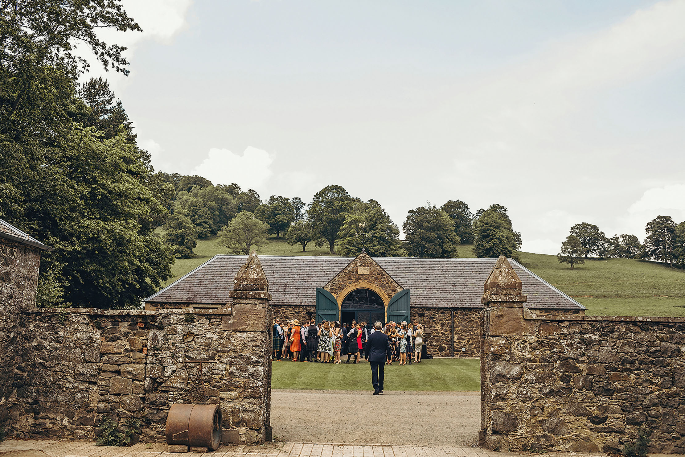
As the world has changed, so, too, has the approach of landowners. Not only have some estates sold properties to pay for maintenance on the big house, dividing up what would once have been fully ‘branded’ villages, but marking territory has become a little unfashionable.
‘There’s sensitivity about showing your ownership in that way,’ says independent heritage consultant John Hoy. ‘Times have changed — you don’t need to draw attention to it now.’ Mr Hare agrees. ‘I’ve never felt from Blenheim’s point of view that we needed to make that kind of statement of ownership.’
The estate is raising money for maintenance by building new local homes and these, notes Mr Hare, will not have a paint colour. Instead, at Park View, a development in East Woodstock, residents ‘sign a covenant that says they won’t paint the houses particular colours’.
Whatever the colour, or how often it occurs, most important of all is its upkeep. After all, like a boundary wall, paint sets the example. ‘There’s nothing worse than driving through a village and seeing cottages looking as if they need a good lick of paint,’ says Mr Hoy.
Are there lessons here for the rest of us? Most of us don’t have 300 cottages to consider when decorating, but, to an extent, the same rules apply when painting your front door as your stables, says Joa Studholme.
‘Think about when you approach it from far away. Have you got lawn in front, or gravel, or tarmac? All those elements make a big difference.’
The goal, notes Patrick Baty, is to ‘get the balance right. It’s like being well dressed. It’s not blindingly obvious, but after you’ve left that person’s company, you think, gosh, that was all just right. It’s English understatement.’
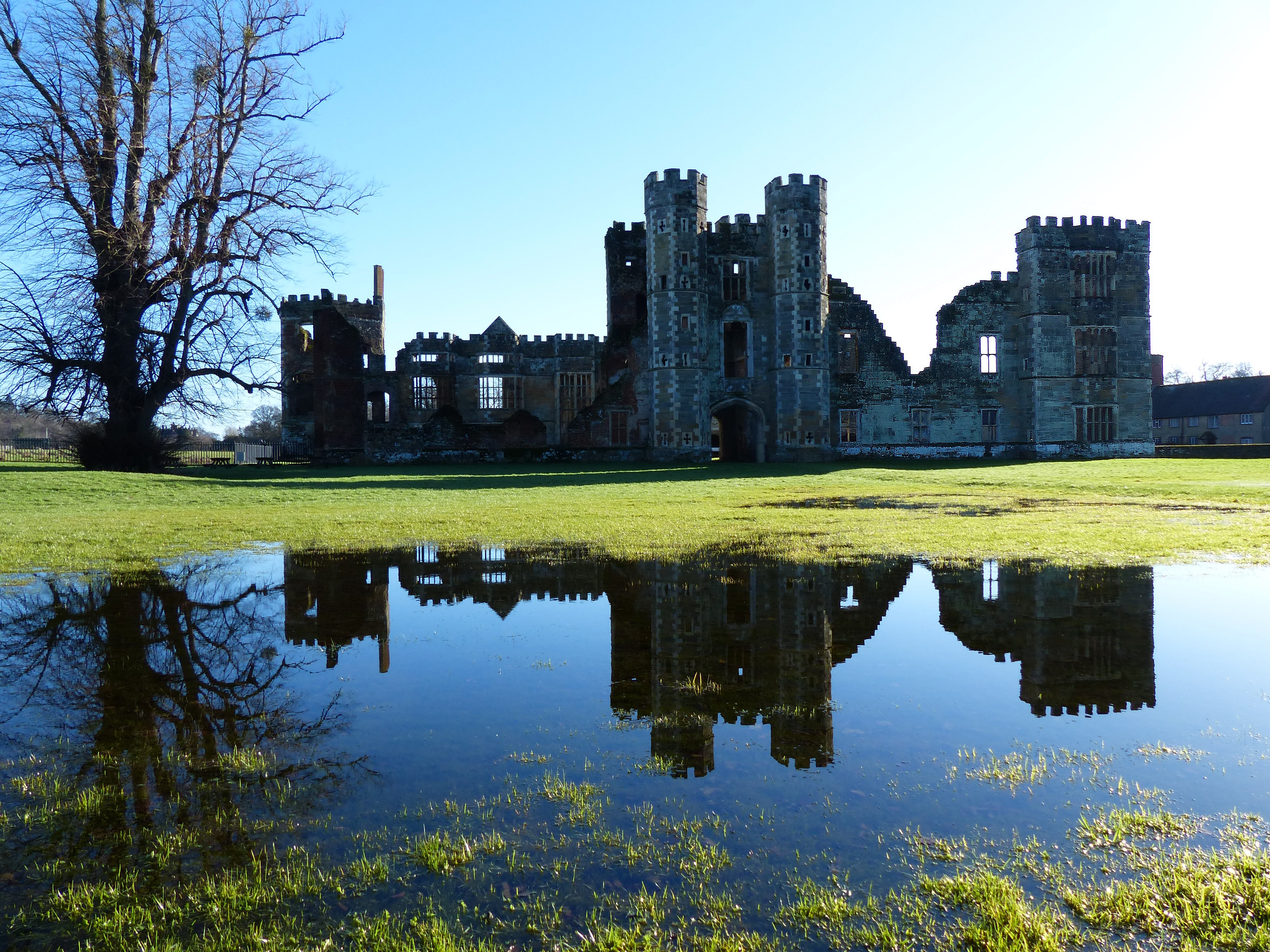
The tale of the fire that turned Cowdray's ancient castle to ruins, the treasure hunters who made it worse, and how what was left was saved
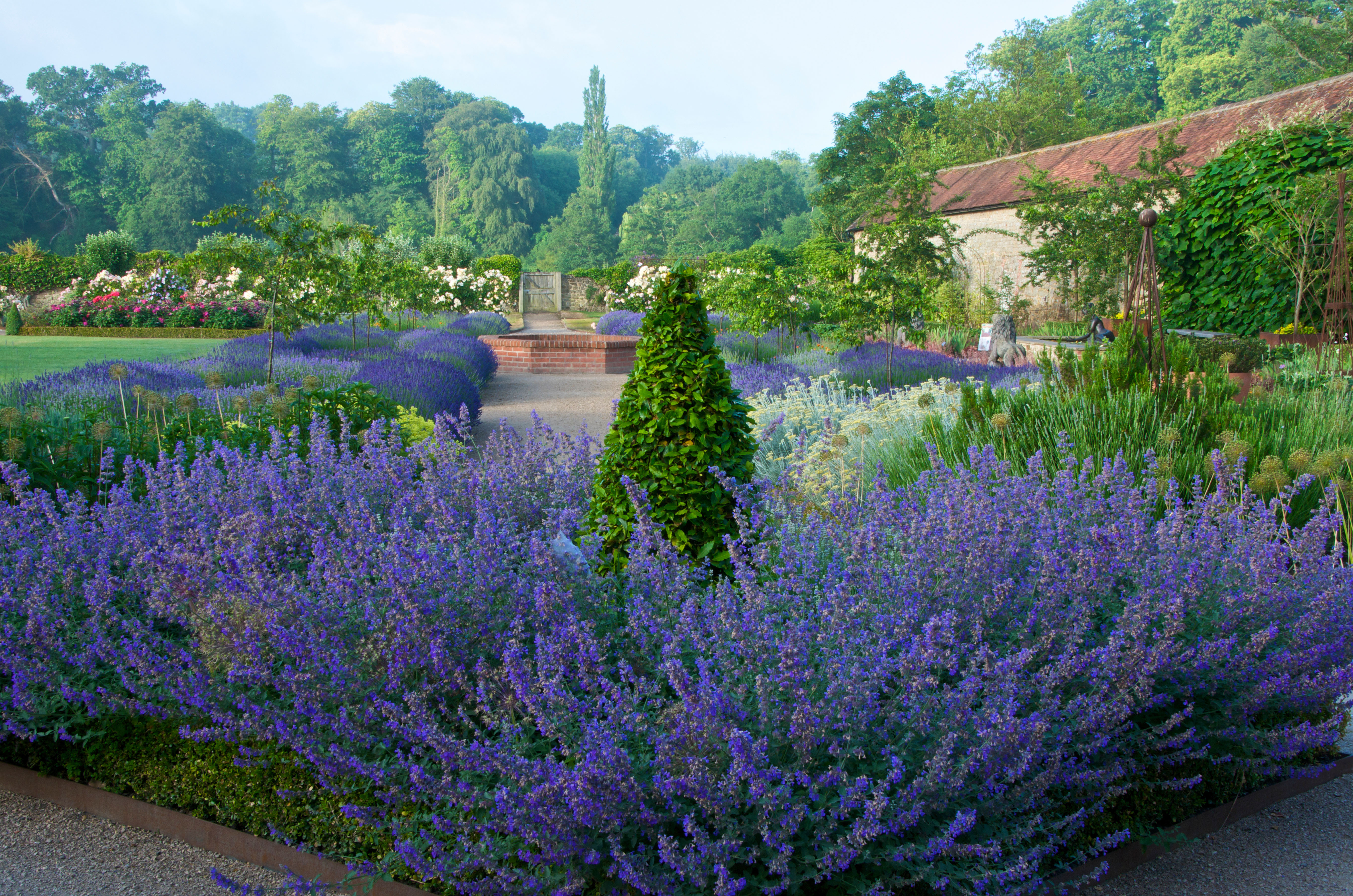
How to make a living off your garden: 'The garden draws you in with its wonderful sense of stillness'
Making your living off your garden is a dream for many of us — but it needn't be a dream, as