My favourite painting: Matthew Williamson
Designer Matthew Williamson chooses an abstract modern piece that contrasts with his professional style.


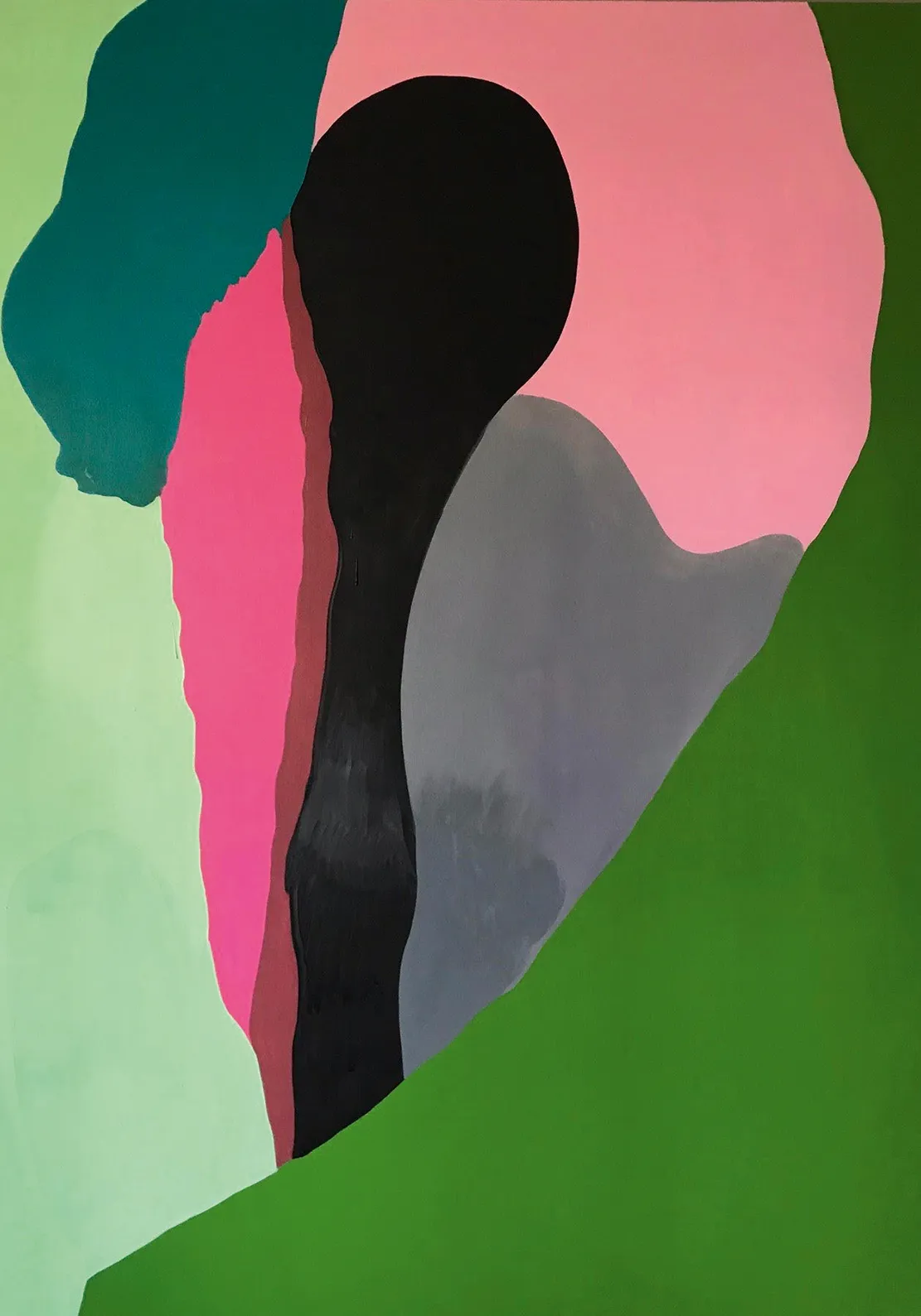
Matthew Williamson on 'Clearly' by Les Rogers
‘I’m a maximalist, often drawn to objects, furniture and furnishing textiles with some age or patina to them. However, when it comes to artwork, I love modern and graphic pieces that contrast nicely with my typical aesthetic. I’ve long admired Les Rogers, his confidence and wonderful use of colour. His paintings are titled, but abstract enough for the viewer to interpret the meaning in their own way.
'Clearly is a perfect example of his work: the form and composition seem quite simplistic and random, but I imagine it’s hard as an artist to achieve a pared-back look. I love the predominant tones of green and pink in this piece, colours I’m often drawn to in my own work because they contrast and complement so well.’
Matthew Williamson is an interior designer and former fashion designer.
Charlotte Mullins comments on 'Clearly'
Les Rogers likes to surprise himself by switching styles and changing direction with each series. Consequently, he has created photorealist works, gestural abstraction, post-modern mash-ups and intimate erotic figuration. His own website calls him ‘stylistically promiscuous’: mix Philip Guston and Cecily Brown with Willem de Kooning, Martin Kippenberger and Dana Schutz and you are halfway there.
This large painting is from an abstract series that still carries a hint of figuration in the occasional brushstroke: a wave of hair, the silhouette of a face or the outline of a leg. Many of his paintings from 2018–19 hint at a figurative source despite their flat planes of colour (which, rather surprisingly, are painted in slow-drying oil.) Clearly looks like a stamen inside a flower, the cyclamen-pink petal laid over a green leaf. Despite the flatness of the teal, pink and leaf-green areas, the New Jersey-based artist gives the black form shadows through the two-tone grey cone and the brown stripe that flanks the pink. These push the black form forwards, as if it is emerging from the green below.
Mr Rogers sees his abstract work as ‘more distilled essences of a place or person to the point where they have gone from description and become a suggestion that could go either way — good or bad; beautiful and calming or ugly and menacing’. Each painting is based on one or more photographic sources — he wants them to critique the overwhelming and encyclopaedic array of imagery that bombards us in the world today.
Sign up for the Country Life Newsletter
Exquisite houses, the beauty of Nature, and how to get the most from your life, straight to your inbox.

Charlotte Mullins is an art critic, writer and broadcaster. Her latest book, The Art Isles: A 15,000 year story of art in the British Isles, will be published by Yale University Press in October 2025.
-
Graham Norton's elegant East London home hits the market, and it's just as wonderful as you would expect
The four-bedroom home in Wapping should be studied for how well it uses two separate spaces to create a home of immense character and utility.
-
Sign of the times: In the age of the selfie, what’s happening to the humble autograph?
When Ringo Starr announced that he was no longer going to sign anything, he kickstarted a celebrity movement that coincided with the advent of the camera phone and selfie. Rob Crossan asks whether, in today’s world, the selfie holds more clout than an autograph?
-
'As a child I wanted to snuggle up with the dogs and be part of it': Alexia Robinson chooses her favourite painting
Alexia Robinson, founder of Love British Food, chooses an Edwin Landseer classic.
-
The Pre-Raphaelite painter who swapped 'willowy, nubile women' for stained glass — and created some of the best examples in Britain
The painter Edward Burne-Jones turned from paint to glass for much of his career. James Hughes, director of the Victorian Society, chooses a glass masterpiece by Burne-Jones as his favourite 'painting'.
-
'I can’t look away. I’m captivated': The painter who takes years over each portrait, with the only guarantee being that it won't look like the subject
For Country Life's My Favourite Painting slot, the writer Emily Howes chooses a work by a daring and challenging artist: Frank Auerbach.
-
My Favourite Painting: Rob Houchen
The actor Rob Houchen chooses a bold and challenging Egon Schiele work.
-
My Favourite Painting: Jeremy Clarkson
'That's why this is my favourite painting. Because it invites you to imagine'
-
The chair of the National Gallery names his favourite from among the 2,300 masterpieces — and it will come as a bit of a shock
As the National Gallery turns 200, the chair of its board of trustees, John Booth, chooses his favourite painting.
-
'A wonderful reminder of what the countryside could and should be': The 200-year-old watercolour of a world fast disappearing
Christopher Price of the Rare Breed Survival Trust on the bucolic beauty of The Magic Apple Tree by Samuel Palmer, which he nominates as his favourite painting.
-
My favourite painting: Andrew Graham-Dixon
'Lesson Number One: it’s the pictures that baffle and tantalise you that stay in the mind forever .'