Why the interior design industry should ignore Pantone’s colour of the year and stick to its guns
A colour your landlord would adore is not one worth celebrating, argues Lotte Brundle.


Exquisite houses, the beauty of Nature, and how to get the most from your life, straight to your inbox.
You are now subscribed
Your newsletter sign-up was successful
Pantone, the American company best known for their standardised colour system, has announced its annual colour of the year for 2026 – or ‘color’, as they’d call it. This is a tradition they have observed since the year of my birth, 1999, so I have grown up with a new annual ‘it-shade’ that’s supposed to sum up the ‘vibe’ of the year to come. Sadly, 2026 seems set to be a very bland 12 months indeed.
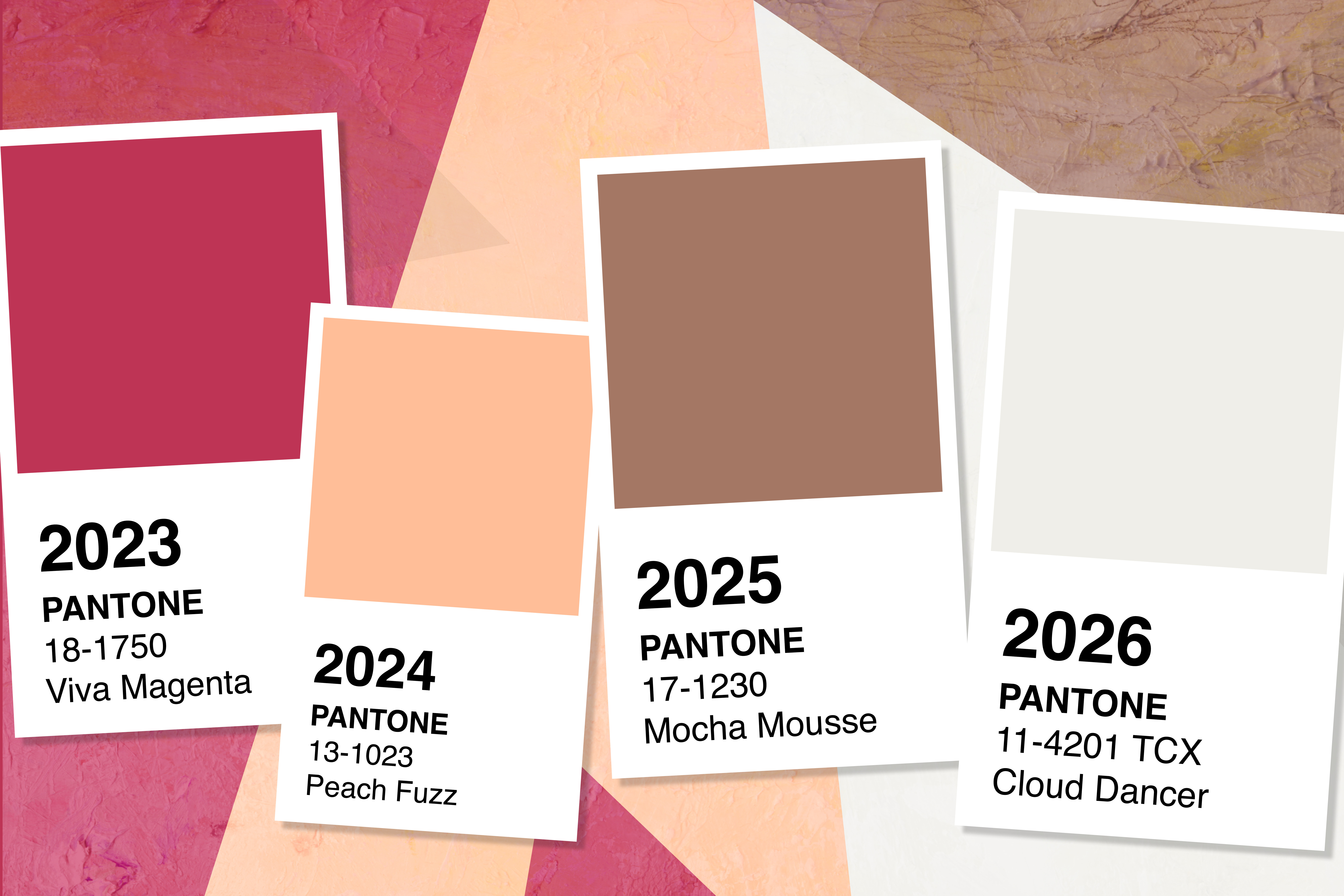
Last year Pantone’s colour clairvoyants prophesied the visually appealing merits of brown. Or as they sexed it up: ‘Mocha Mousse’. In 2024 they made the decision to name the rather jovial pastel ‘Peach Fuzz’ the year’s hue, and in 2023 the honour was bestowed upon the bold and playful red ‘Viva Magenta’. The era of maximalism, of colourful living, was in full swing. With the exception of one beige year (2006’s lacklustre ‘Sand Dollar’) and the altogether uninspiring ‘Illuminating and Ultimate Grey’ of 2021, Pantone’s choices have been bright and joyful. That was until next year’s colour announcement — the most underwhelming shade of all — plopped into my inbox. Pantone’s Color of The Year for 2026 is — drumroll please… off-white. Is this really the best representation of the zeitgeist of the year to come?

'Cloud Dancer' is Pantone's colour of the year for 2026.

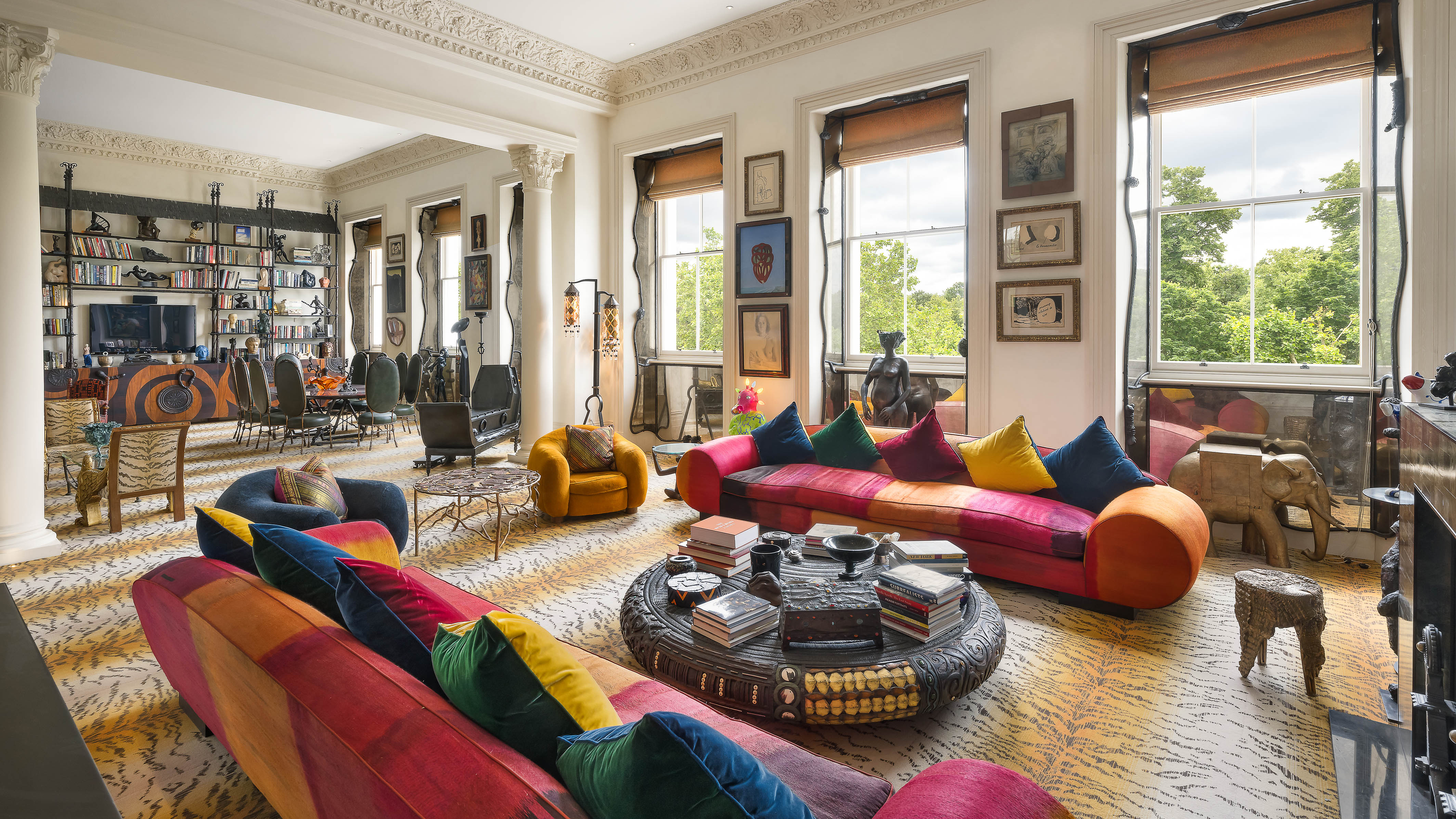
A colourful way to live: Sarah Corbett-Winder’s London home, designed in collaboration with Birdie Fortescue.
‘Cloud Dancer’ is what they are terming it, and it is a stark departure from what came before. In a world where my generation (Gen Z) have been priced out of owning homes, choosing a colour so close to ‘Landlord White’ seems almost insulting. I dream of dipping a paintbrush heartily into a decadent red, an effervescent yellow or a tranquil blue and covering my walls, but I can’t, because they’re not really my walls, I’m just borrowing them. Imagine finally getting on the housing ladder and being encouraged to paint the walls a shade of white.
Don’t get me wrong, it’s a lovely off-white, as off-whites go. A 'billowy, balanced white imbued with a feeling of serenity' according to the Pantone Color Institute (PCI), whose executive director Leatrice Eiseman called the shade ‘a calming influence in a frenetic society’. While I agree with Leatrice that we definitely do need more calming influences in 2026, I can’t help but be a little disappointed. It’s a very conformist colour, you see, and not a trend the interior design industry should follow. If we all change our homes and our wardrobes and fill them with things the colour of Cloud Dancer, it will only be a matter of months before the 2027 colour of the year comes along and we have to start afresh. Thus the cycle repeats, our bank balances are hit anew, and more and more items are thrown away before they’ve had a chance to be properly enjoyed and treasured, as they should be. The endless greed of capitalism is fed by Pantone’s colour of the year.

This shade does not inspire greatness for the year to come.

Country Life's stand at the 2025 Chelsea Flower Show, by interior designer Isabella Worsley and landscape designer Hugo Elwes, embraced vivid hues.
Additionally, in an era where it seems that everyone — young and old — is using plastic surgery to get the same face and Ozempic to get the same body, we could do with celebrating aesthetic choices that are more unusual and bold, rather than ones that encourage us to be like everyone else. Cloud Dancer is, I’m afraid, the ‘Mar-a-lago face’ of the design world. Both should be staunchly avoided.
Although the vice-president of PCI, Laura Pressman has called it ‘a key structural color’ that allows ‘all colors to shine’, I can’t help but think that all colours shine better without it around. Timeless pieces, whatever colour, never go out of style. And, as the pages of Country Life prove, the great British country house wasn’t made great by following micro trends. They have grand, colourful interiors that have lasted centuries in style, and will continue to impress for centuries more.

How Pantone would have us style our interiors: head-to-toe Cloud Dancer.

Art collector Pauline Karpidas's former London home may have had off-white walls, but that is where it stopped.
With charity shopping and thrifting among the rise with my peers, I can’t see how Cloud Dancer will really catch on for us. Giving pre-loved pieces a new life in your home, or in your wardrobe, seems to me to be a much more stylish choice than a life the colour of egg shells, milk, printer paper and rented walls.
Exquisite houses, the beauty of Nature, and how to get the most from your life, straight to your inbox.

Lotte Brundle joined Country Life as their Digital Writer in 2025. She was previously a sub-editor on the news desk at The Times and The Sunday Times as part of their graduate trainee scheme. Before that she was The Fence's editorial assistant. She has written features for The Times, New Statesman, Metro, Spectator World, The Fence and Dispatch. She coordinates Country Life’s weekly digital Q&A interview series, Consuming Passions.