Why 'blue and green should never be seen' is outdated, absurd and just plain wrong
Arabella Youens investigates the old adage that 'blue and green should never be seen' — and finds that it's simply not true.

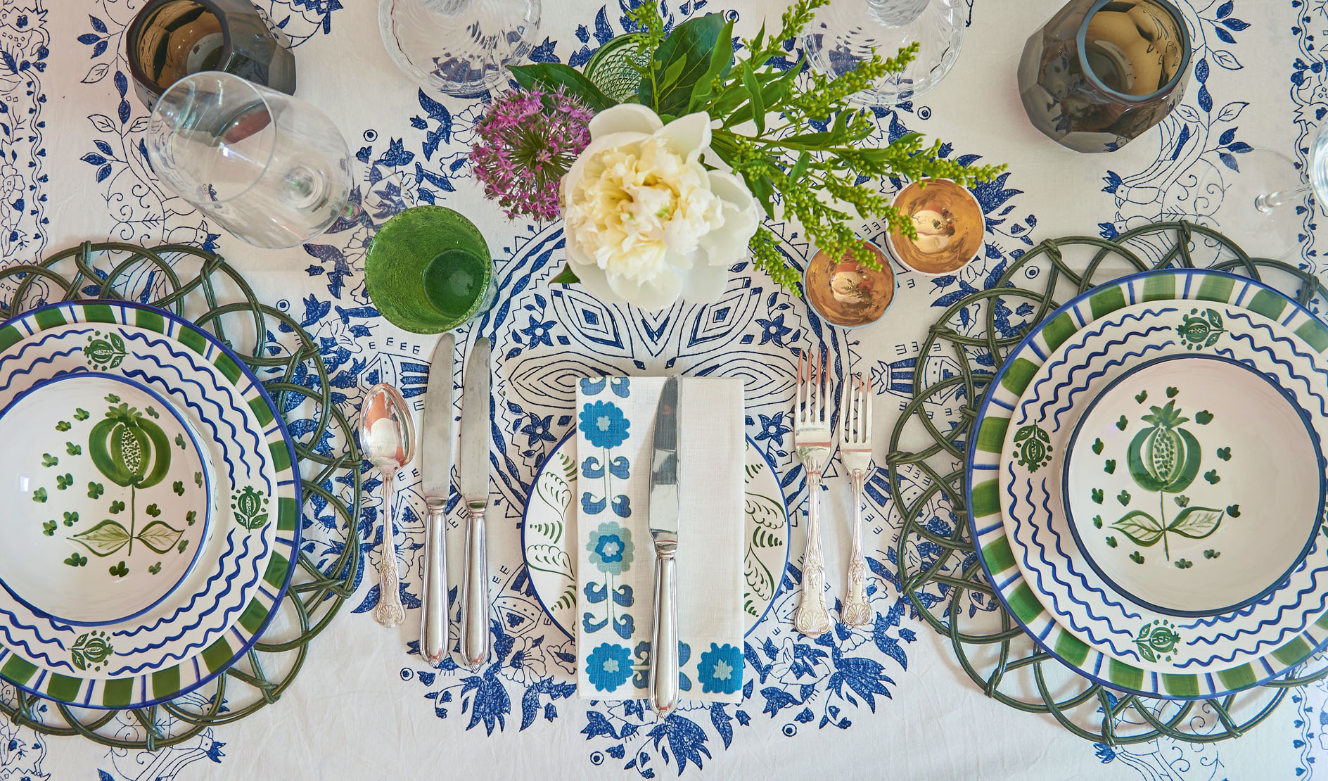
‘Irises, bluebells and forget-me-nots have long demonstrated that blue and green look beautiful together,’ points out Nina Campbell, who has recently launched Parvani, a fabric and wallpaper design featuring peacocks, flowers and paisley shapes in a blue and green colourway. ‘I was taught that they shouldn’t be seen together, except on a faerie queen,’ she says, ‘but you only have to look at the Black Watch tartan to see that it’s perfectly fine to mix them. It’s the tonality that is most important,’ says Mrs Campbell.
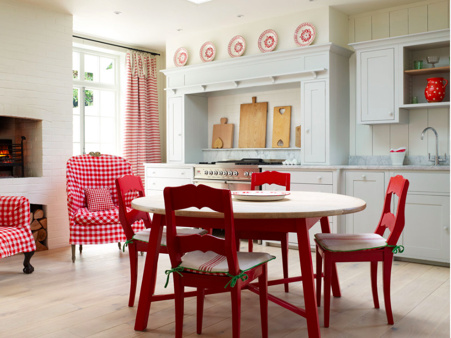
She particularly likes the addition of an acidic green into the mix, which adds a sharpness to a scheme. ‘What’s much more challenging is pairing red and green. It’s difficult to avoid that sort of scheme looking too Christmassy.’
One theory is that the saying derives from a seafarer’s tradition that that the hulls of boats should not be painted green lest they become invisible when capsized. Historical paint consultant Patrick Baty of Papers and Paints in Chelsea believes that the origins of this mantra go back to the colour wheel, where blue and green sit side by side. He gives short shrift to the idea that they don’t work together.
‘Rules are for the guidance of wise men and the obedience of fools,’ he says. ‘Look at some of the ceilings by Adam and you see that the two colours have been used happily together for centuries.’
‘It simply doesn’t occur to me to work with a rule book when it comes to colour,’ agrees decorator and textile expert Susan Deliss.
‘It’s about what feels right for the room, its light and the environment around it. It’s a question of tone and judgement: in a sunny climate, you can get away with more acidic greens, for example, but in an English country house, it’s important to dial things down and look at Nature for inspiration.
‘Also, beware that two colours can look sickly in a scheme and that there should always be a third accent colour in the mix.’
Exquisite houses, the beauty of Nature, and how to get the most from your life, straight to your inbox.
Decorator Penny Morrison remembers being given the blue/green advice as a child by her parents. ‘The same was true of combinations such as brown and black. I’m not sure I paid them a lot of attention, however.’
Colour pairings are concepts that move with the times, adds Mrs Morrison. ‘Young designers are putting red and pink or red and orange together with fresh and fun results.’ She is a great fan of green in all its myriad shades. ‘We painted our library in Farrow & Ball’s Arsenic several years ago and I wondered whether it was a mistake, but I needn’t have worried. Edward Bulmer’s Invisible Green, which we have in our London showroom, is another favourite. It’s a fantastic colour that cheers everything up.’
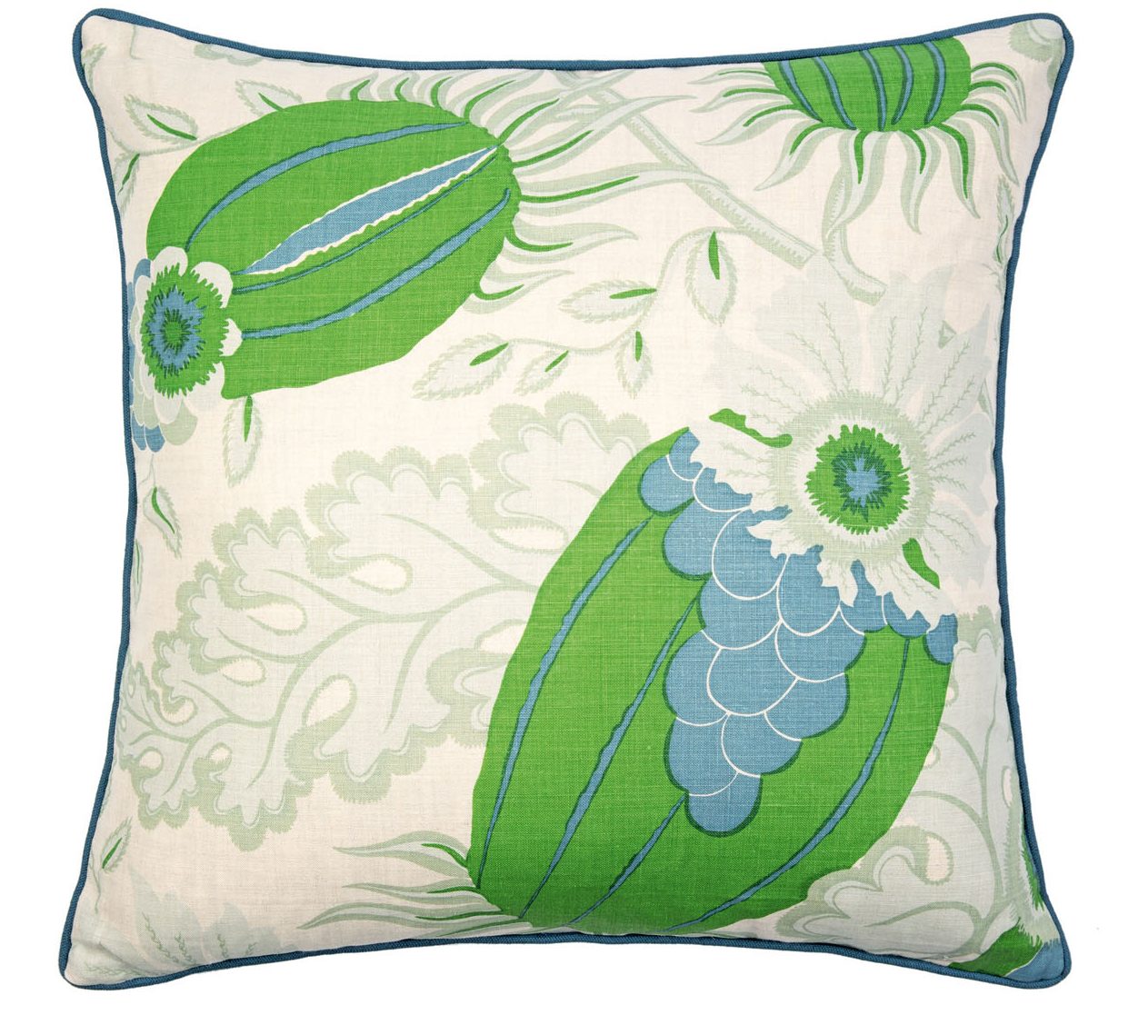
Anyone feeling nervous about pairing the two colours could start safely with decorative details, such as a blue-and-green rug or blue lampshade with a lime-green trim. ‘Another option is simply to use some cushions,’ says Mrs Morrison. ‘Christopher Farr’s Carnival in green is a classic design that fuses chintz with 1960s psychedelia. It would look fabulous on a pale-blue sofa or in a dark-blue painted room. The opportunities are endless. I’d go so far as to say that mixing blue and green is almost a must.’
Credit: Katrin Cargill Interiors
How to create a rustic, East Coast kitchen in an English home
Credit: Andrew D Steel
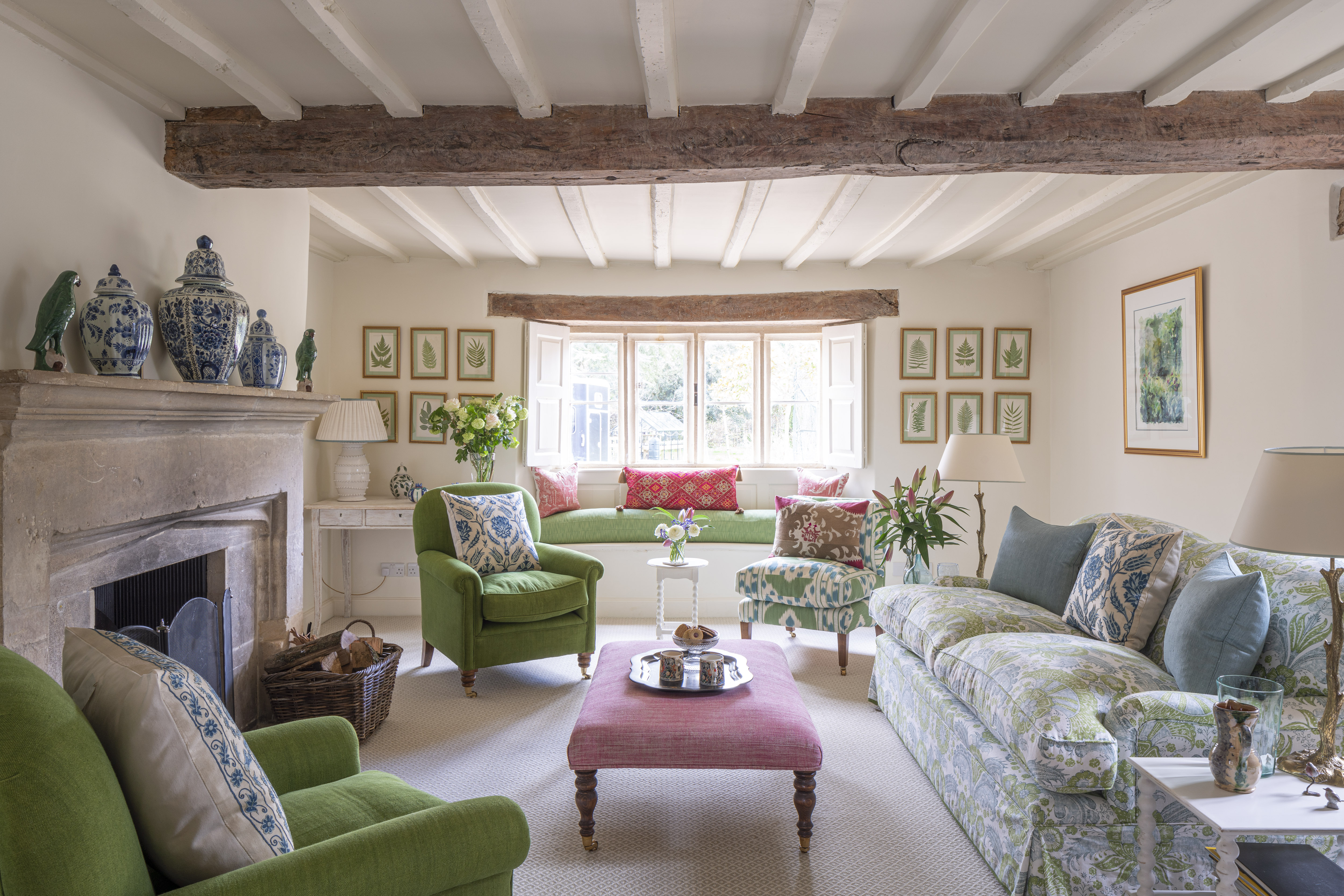
Susan Deliss's fresh country-house drawing room that shows how to be smart without being stuffy
Susan Deliss used a simple, but uplifting mixture of colours to transform a country-house drawing room.
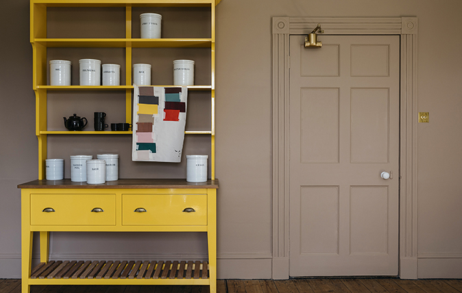
The future’s bright: New colour palettes bring life to period properties
Period houses are being treated to a jauntier palette of colours, says Giles Kime, as he explores bold beautiful hues
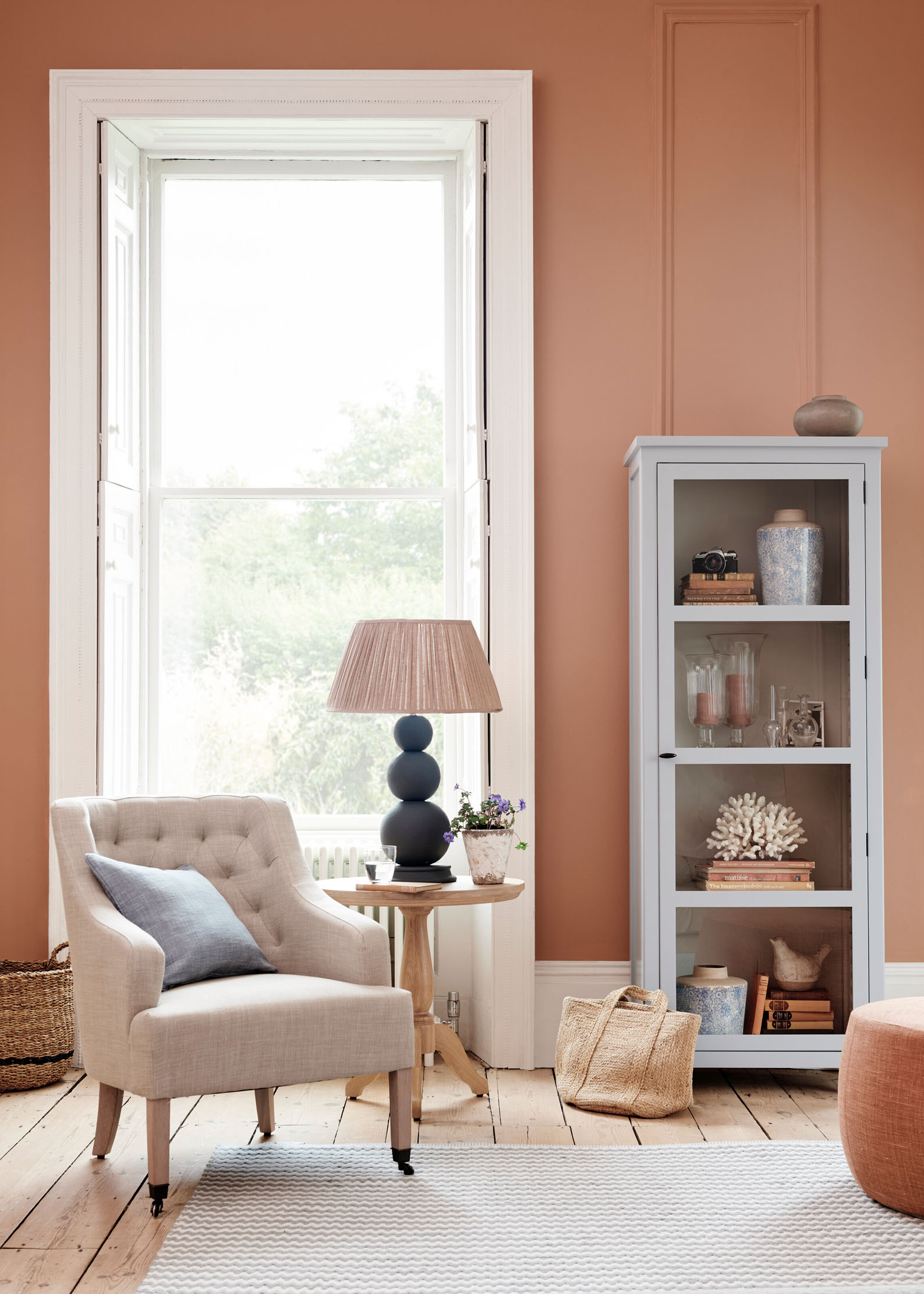
Credit: Neptune
Best lampshades: 12 of the finest lampshades to bring light into your life
Designers are using a variety of patterns to transform lampshades. Amelia Thorpe selects ten of the best lampshades to step
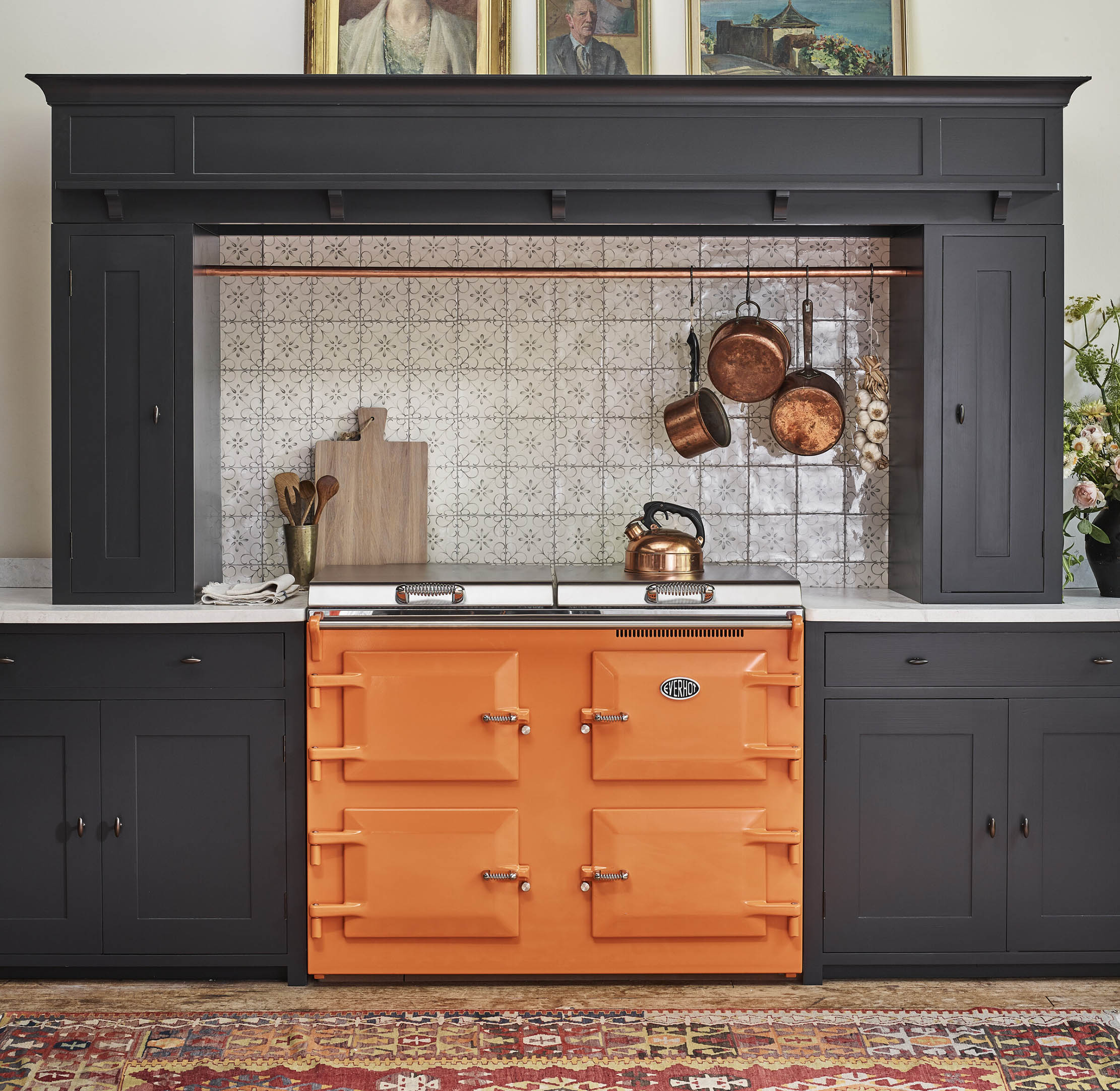
Colourful kitchens: Why even a dash of a bold, vibrant hue goes a long way in a kitchen
A generation or two ago, kitchens were routinely re-done in bright colours — and there's something in colourful kitchen design even
